Modern Interior Paint Colors: A Complete 2025 Guide
Choosing the right paint shade can change the entire feel of your home. Today’s trends focus on calm environments, soft finishes, and shades that bring comfort. In this guide, we’ll walk through the most modern interior paint colors popular choices, how to use them, and easy ways to refresh a space without much effort.
Why Color Matters in Home Design
Paint sets the tone for each room. It affects how bright the space feels, how open it looks, and even how you feel while spending time in it. A good shade can make a small room feel bigger or turn a dull corner into a warm spot.
Top Trends Shaping Today’s Palette
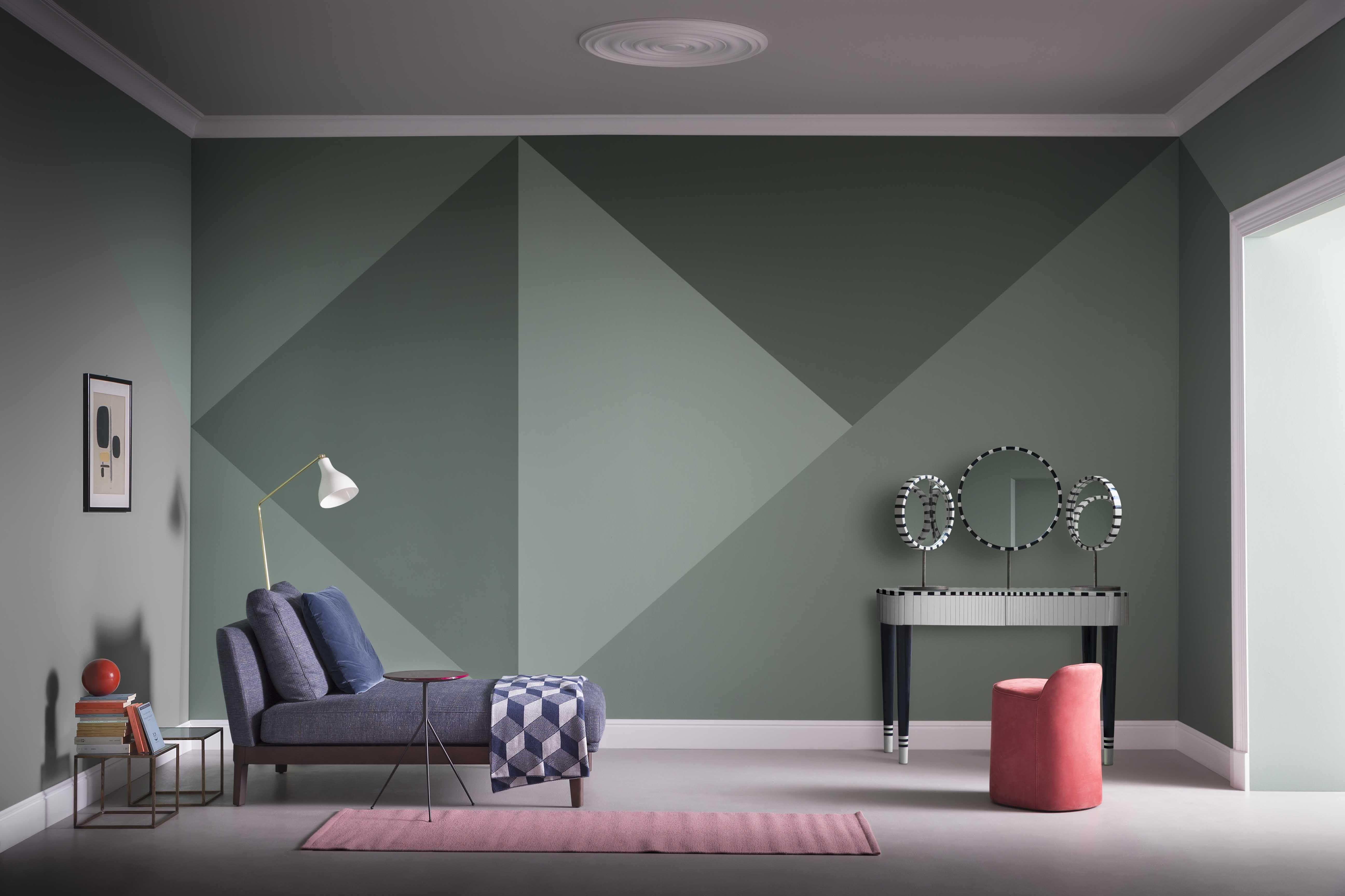
Several themes continue to guide color choices in 2025. Homeowners prefer calm tones that create a relaxed feeling. Many also look for colors that work with natural textures like wood, stone, or linen. Neutral shades remain the base, but soft greens, warm browns, and dusty blues are becoming more common.
Popular Shades for Every Room
Here are some of the most used tones this year:
1. Soft Neutrals
Neutrals remain a favorite because they match almost anything. These include:
-
Warm beige
-
Light cream
-
Soft mushroom
-
Greige
These shades work well in living rooms and open spaces because they make the area feel smooth and connected.
2. Calm Greens
Green continues to grow in popularity. Light sage and mossy tones bring a natural touch. They look great in bedrooms and kitchens, especially when paired with plants or wooden accents.
3. Muted Blues
Dusty blue gives a relaxed feeling. It works well in bathrooms, home offices, and reading corners. This shade adds color without overwhelming the space.
4. Warm Earth Tones
Clay-inspired shades like terracotta, caramel, and soft brown are making a comeback. They feel cozy and pair well with neutral furniture.
Using Modern Interior Paint Colors in Different Spaces
Modern interior paint colors help you design a space that feels current without being too bold. Here are some ways to use them effectively.
Living Room Ideas
The living room is the main gathering space. Many people choose:
-
Soft beige for a warm base
-
Sage green for a calm corner
-
Dusty blue for an accent wall
A single feature wall can add a highlight without needing full renovation. This also keeps the room bright and clean.
Bedroom Inspiration
Bedrooms should feel restful. Modern interior paint colors like warm neutrals or muted green shades work well. They create a smooth backdrop for pillows, bedding, and natural textures. Soft lighting helps blend the tones even better.
Kitchen and Dining Areas
Light cream, pale olive, and sandy beige brighten the kitchen. These shades reflect light in a helpful way, which is ideal if your kitchen doesn’t get much sunlight. Earthy tones also look good alongside wooden cabinets or stone countertops.
Home Office Shades
A home office should feel organized and calm. Light grey, dusty blue, and soft beige support focus. These colors reduce visual noise and make the space feel more structured.
How to Choose the Right Shade
Picking a shade can feel overwhelming, but these steps make the process easier:
-
Check lighting. Natural light makes colors look softer. Artificial lighting may add warm or cool tones.
-
Test samples. Paint a small patch on each wall to see how the color changes throughout the day.
-
Match your furniture. Choose shades that complement your main pieces instead of clashing with them.
-
Start small. Begin with one room if you’re unsure. This helps you understand what works best in your home.
-
Think long-term. Choose colors you can enjoy for years.
Balancing Colors Across the Home
A home feels complete when colors flow smoothly from room to room. Keep a base tone that appears in most areas, like a warm neutral. Then add softer accents in bedrooms or feature walls in living spaces. This helps create a consistent feel without making the design look repetitive.
Tips for a Cleaner, Modern Look
Here are a few simple ideas to help you get a neat finish:
-
Keep trim crisp and clean.
-
Use matte finish for a soft, modern look.
-
Add texture through rugs, curtains, and cushions.
-
Avoid too many strong contrasts unless you want a bold look.
-
Stick to two or three shades in one room.
Mistakes to Avoid
Even good colors can look off if used incorrectly. Common issues include:
-
Choosing a shade without testing it first
-
Painting all rooms dark without enough lighting
-
Using too many bright tones in small areas
-
Ignoring the undertones of furniture and flooring
Taking a few minutes to plan your palette helps avoid these problems.
Final Thoughts
Updating your walls is one of the easiest ways to refresh your home. The right selection gives your space a clean, current feel. Modern interior paint colors fit well with natural textures, soft lighting, and simple décor. By testing shades, checking lighting, and planning room by room, you’ll get a balanced look that feels comfortable and welcoming.